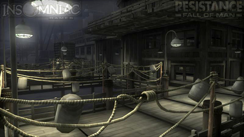
Creating the Lighting for Resistance: Fall of Man
Page 2
![]()
The job of a lighting artist is pretty much what one would expect: you create and place the lights in the levels in an effort to create a believable, realistic world. The methods you use to create and place these lights will differ greatly, depending on the programs and tools in use at the company you work for. But by and large, there are a lot of similarities regardless of the specific tools, just as there are a lot of similarities between different 3D programs.
In the screenshots here, only some of the levels are shown, as I only got screen grabs of the levels I was assigned to light. Let's start with a few from the cannery area, and on through the conversion chambers.
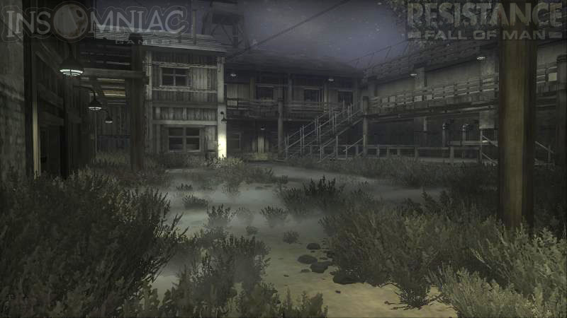
Outdoor courtyard at night, near one of the large cannery buildings.
Designer: Jack Mayer
Environment Artists: Marcus Lull, Brian Watson.
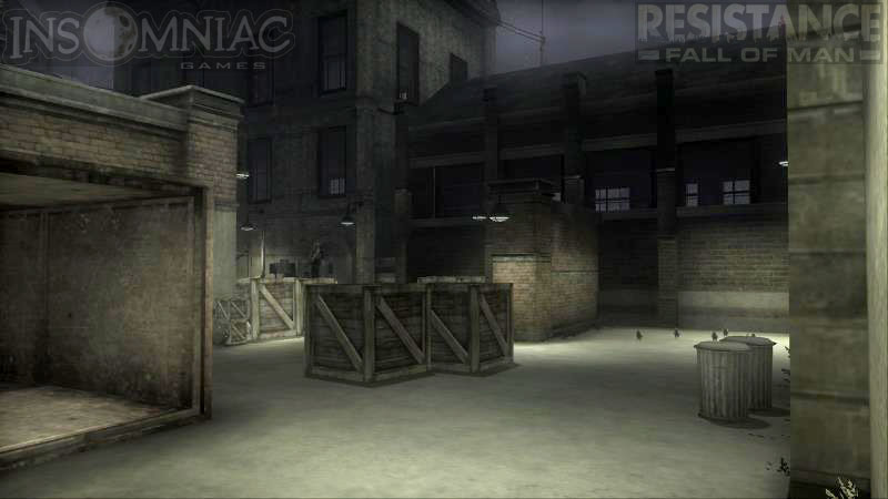
Courtyard area before the second cannery building.
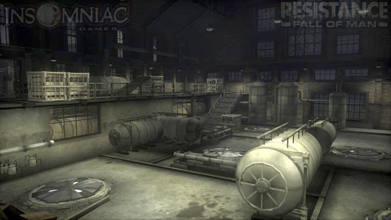
Inside the second cannery.
This shows the lighting only, with textures turned off, and the wireframes of the geometry.
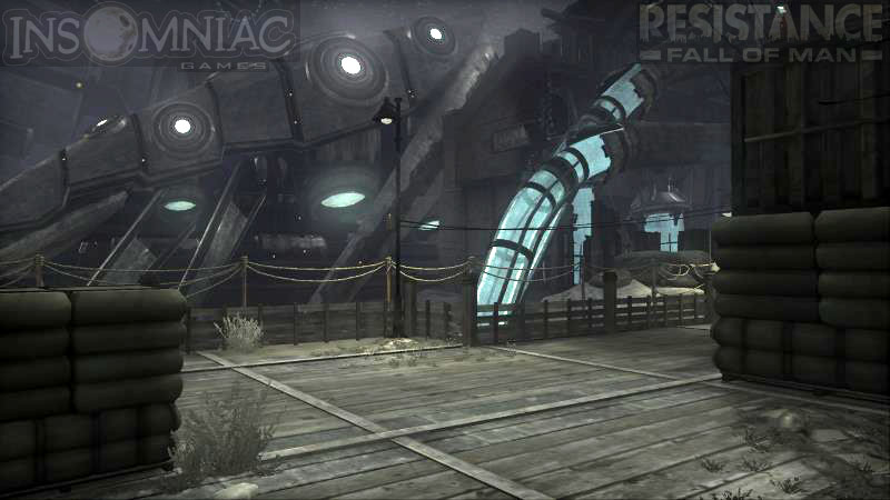
As you make your way through the level, more Chimeran architecture is seen.
Artist Marcus Lull says: "One of the challenges I faced when creating this level was presenting the player with a fish cannery that slowly becomes more Chimeran as the player progresses. I really wanted the player to feel like they were going not only to a place that no other human had seen, but that they were going deeper and deeper into the heart of this very alien world where terrible and cruel acts were taking place. It was a delicate task of balancing the demolished human structures with the parasitic Chimeran architecture."
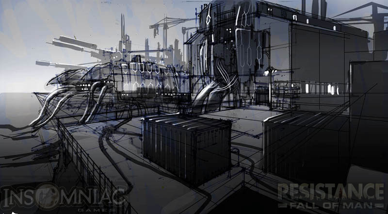
Concept drawing of cannery/conversion area by Darren Quach.
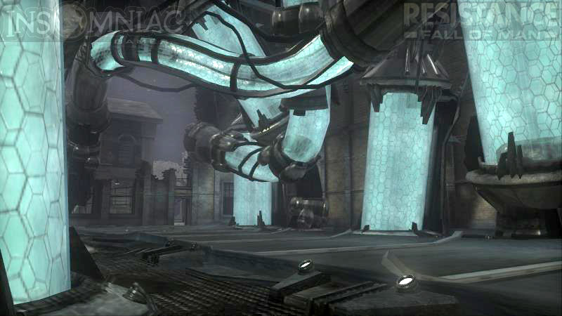
Transport tubes that have been retro-fitted amongst the old architecture.
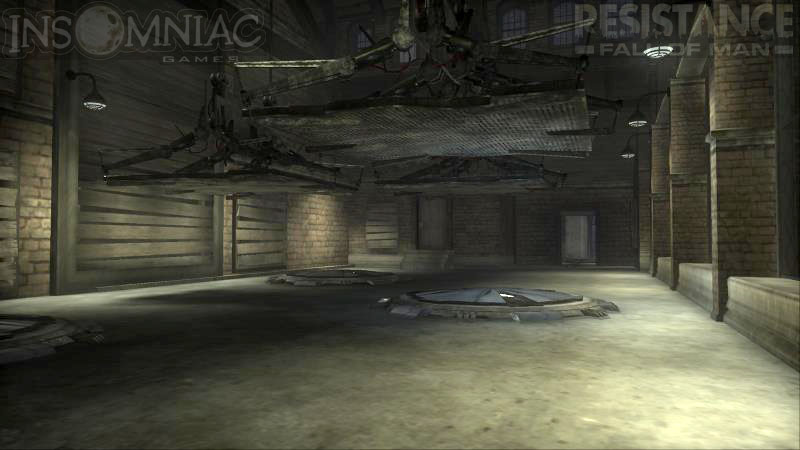
Suspension platforms in one of the conversion buildings.
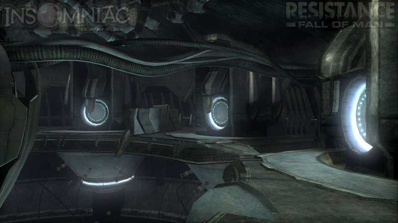
Inside the cooling unit installation.
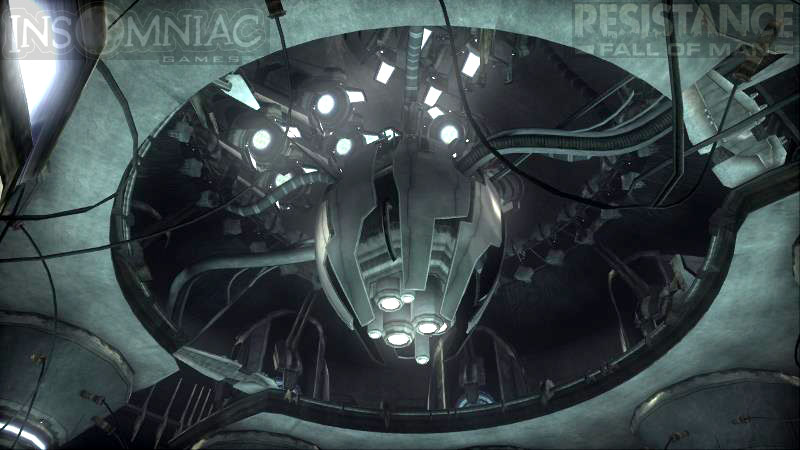
Details in the upper level of the cooling tower.
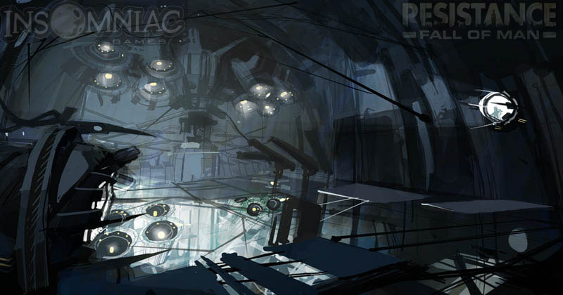
More Darren Quach concept art, showing the conversion chamber and cooling tower interior. The concept art helps get everybody on the same page, so there's a clear understanding of the direction we're moving in for any given area. It also helps establish the color palette and in many cases, the lighting.
Back outside on the docks. Marcus Lull on laying out levels: "Sometimes when you make levels you have to start out with place holders, and in this level we created an outhouse looking building just for that purpose. So as the player goes through what is supposed to be this scary and dark level that has been overrun and mangled with Chimeran architecture, they come out to find this dumpy little outhouse that has been untouched by the Chimerans right in the middle of their path. So the joke became that everything was destroyed except for the outhouses......guess the Chimerans aren't as dumb as they look!"

